Colors play a significant role in our lives, evoking emotions, triggering memories, and influencing our perceptions. Understanding the psychology behind colors is essential for effective visual communication. In this comprehensive guide, we will delve into the world of color psychology, exploring color harmonies, and uncovering the meanings associated with different colors.
The Basics of Color Theory
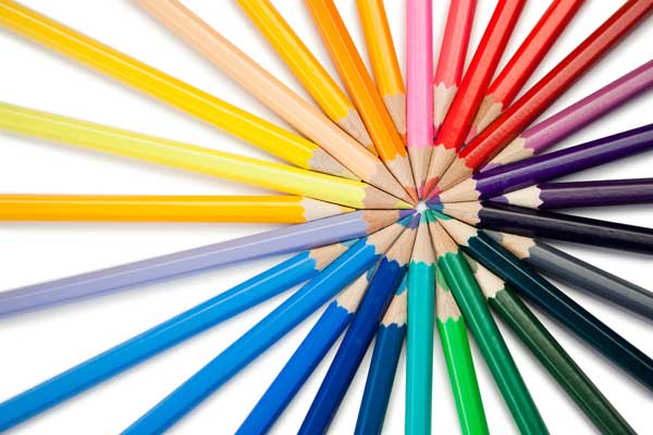
To comprehend color psychology, it is crucial to understand the fundamentals of color theory. The three primary colors, yellow, blue, and red, form the basis for all other colors. Secondary colors are created by mixing two primary colors, while tertiary colors result from combining a primary color with a secondary color. The color wheel serves as a visual representation of these relationships.
Exploring Color Harmonies
Color harmonies refer to the combinations of colors that create a pleasing visual effect. Let’s dive into various color harmonies and discover how they can enhance your designs.
- Complementary Colors: Complementary colors are direct opposites on the color wheel. They create a vibrant contrast when used together, such as yellow and purple or red and green. However, it is crucial to maintain an 80/20 split, with one color dominating while the other complements.
- Analogous Colors: Analogous colors are adjacent to each other on the color wheel. They create a sense of calmness and coherence. Warm analogous colors, such as red, yellow, and orange, can be used to evoke a lively atmosphere, while cool analogous colors, like blue and green, create a serene ambiance.
- Monochromatic Colors: Monochromatic color schemes revolve around variations of a single hue. By using different shades, tones, and tints of one color, you can create a sophisticated and harmonious design. However, it’s essential to introduce enough contrast to avoid monotony.
- Triadic Colors: Triadic color harmonies involve selecting three colors that form an equilateral triangle on the color wheel. These combinations can be achieved using primary colors, secondary colors, or tertiary colors. Triadic color schemes offer vibrance and energy to your designs.
- Split Complementary Colors: Split complementary color schemes start with a complementary harmony and then split one of the colors into two adjacent hues. This creates a visually appealing composition that maintains a balance between contrast and harmony.
- Double Triadic Colors: Double triadic harmonies combine two sets of complementary colors. They can be challenging to master, but when executed correctly, they create captivating and balanced designs.
- Square Colors: Square color harmonies consist of four colors evenly spaced on the color wheel. These schemes offer a wide range of possibilities, allowing for powerful and dynamic designs. However, it is important to maintain an 80/20 split, ensuring one color dominates while the others accentuate.
The Meanings Behind Colors
Colors have symbolic associations and can evoke specific emotions and perceptions. Let’s explore the meanings and connotations commonly associated with different colors:
- Yellow: Associated with creativity, optimism, and liveliness, yellow is an inviting color that grabs attention. It is often used to signify happiness and is commonly associated with the sun and positivity.
- Red: Red is a powerful color that can convey passion, energy, and urgency. It is known to stimulate appetite and attention, making it ideal for call-to-action elements.
- Blue: Blue represents calmness, trust, and reliability. It is often used in corporate branding and healthcare industries due to its soothing and serene qualities.
- Green: Symbolizing growth, harmony, and nature, green has a calming effect and is associated with balance and freshness. It is commonly used in environmental and organic products.
- Orange: Vibrant and energetic, orange exudes enthusiasm and creativity. It can be attention-grabbing and is often used to create a sense of excitement and warmth.
- Purple: Purple is associated with royalty, luxury, and spirituality. It represents creativity and wisdom, making it suitable for artistic and high-end brands.
- Pink: Pink signifies femininity, nurturing, and tenderness. It is commonly used in products and branding targeting a female audience.
- Black: Black represents sophistication, elegance, and power. It is often used to create a sense of luxury and is a popular choice in fashion and high-end branding.
- White: White symbolizes purity, simplicity, and cleanliness. It is commonly used to create a sense of space and tranquility.
Impact of Color Psychology on Emotions
Colors have a profound impact on human emotions and can elicit specific responses. Understanding this impact is crucial when designing for various contexts. Here are some common emotional responses to colors:
- Warm Colors: Warm colors such as red, orange, and yellow evoke feelings of excitement, passion, and happiness. They can create a sense of urgency and energy.
- Cool Colors: Cool colors like blue, green, and purple have a calming effect and are associated with tranquility, trust, and reliability. They can create a sense of serenity and stability.
- Neutral Colors: Neutral colors, such as gray, beige, and white, evoke a sense of simplicity, elegance, and neutrality. They are often used as backgrounds to allow other colors to stand out.
Conclusion
Color psychology is a powerful tool for designers and marketers alike. By understanding the meanings and harmonies of colors, we can create visually stunning designs that evoke the desired emotions and perceptions. Experiment with different color combinations and observe the emotional responses they elicit. Unlock the power of color psychology and enhance your visual communication skills to captivate your audience and create memorable experiences.